Industry News
 Home / News / Industry News / Solid Area Rugs: How to Choose the Right Color and Style for Your Space
  2026.05.12
 Industry News
Content
A solid area rug is one of the most versatile flooring choices available — not because it is neutral or safe in a boring sense, but because a single unbroken color allows every other element in the room to do its job without competition. When your sofa has a strong print, your curtains carry pattern, or your walls have a distinctive color, a solid colored rug ties the room together without adding visual noise. It provides the grounding that the space needs while letting the pieces you have invested in read clearly rather than fighting a busy floor for attention.
That said, a plain area rug is not a default choice for people who cannot decide on a pattern. Used intentionally, a solid rug in the right color and texture becomes the design statement itself — a deep charcoal wool rug in a light Scandinavian-style room, or a rich terracotta flatweave in a room with natural wood and rattan furniture, both make a strong visual impact precisely because the color is uninterrupted across the entire surface. The absence of pattern is what gives the color its full weight, and understanding how to use that quality is what separates a well-chosen solid rug from a forgettable one.
The choice between a solid color area rug and a patterned one comes down to what else is already happening in the room and what role you need the rug to play. Neither is universally better — the right answer depends on the specific visual context of the space.
|
Room Situation |
Better Choice |
Why |
|
Patterned sofa or chairs already in the room |
Solid rug |
Prevents visual overload; lets the furniture pattern read clearly |
|
Plain neutral furniture throughout |
Either works |
A bold solid or a statement pattern both add interest without conflict |
|
Open-plan space needing zone definition |
Solid rug |
Clean color boundaries define zones without visual clutter |
|
Room with plain walls and minimal décor |
Patterned rug |
The rug can carry the visual interest the room otherwise lacks |
|
Layering under a smaller decorative rug |
Solid base rug |
A plain base makes the layered rug the focal point without pattern clash |
|
Small room where space feels tight |
Solid rug in a light tone |
Unbroken color reads as more floor space than a busy pattern |
|
Traditional or heritage-style interior |
Patterned rug |
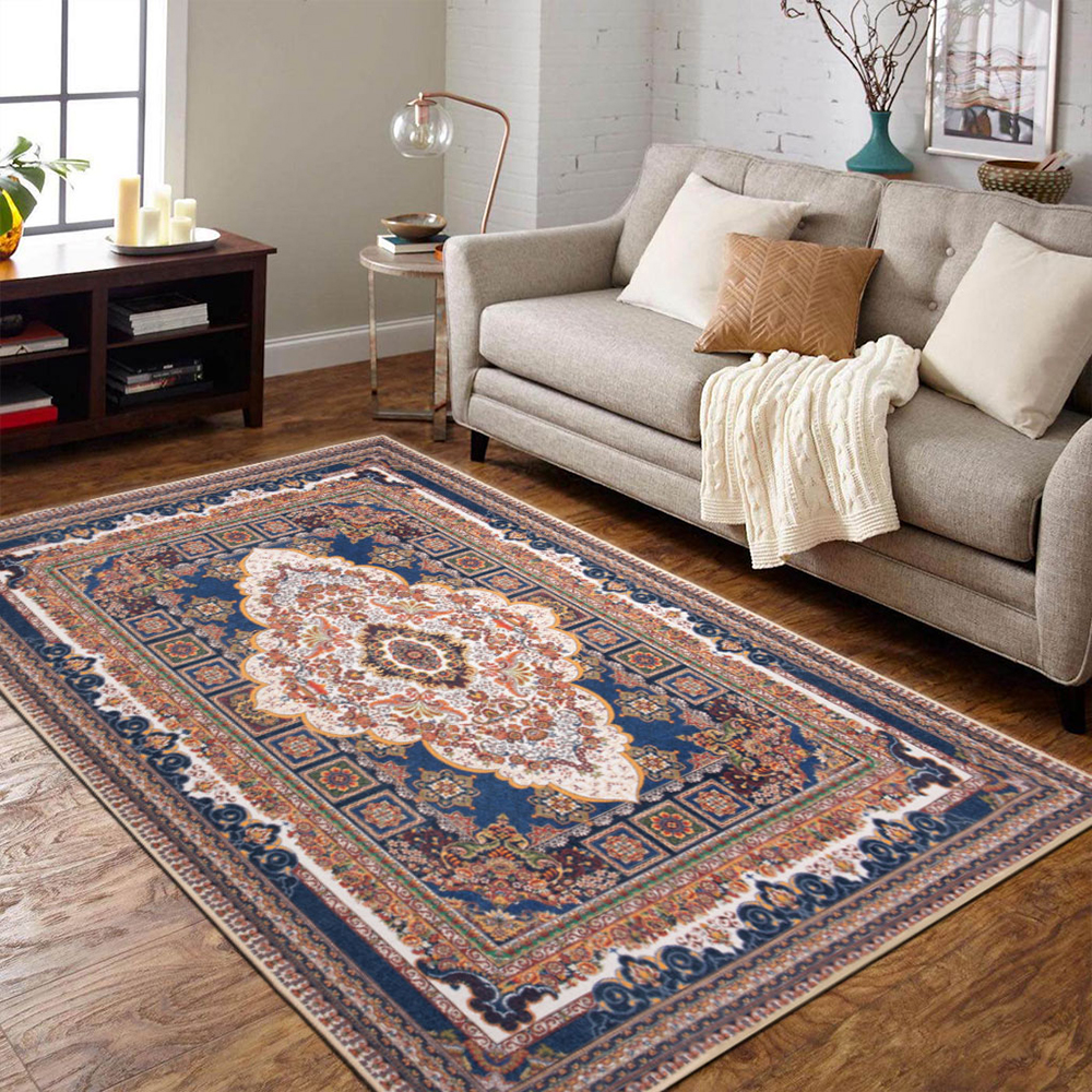
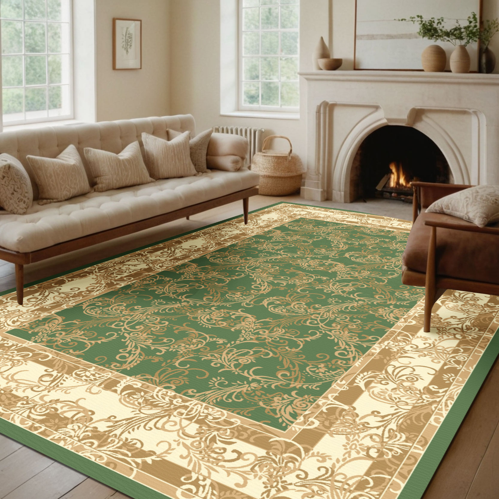
Oriental, Persian, and geometric patterns suit traditional rooms better than plain rugs |
The most useful rule of thumb is to count the number of patterns already active in the room before choosing a rug. If you have two or more patterns in play — on upholstery, cushions, curtains, or wallpaper — a solid indoor area rug is almost always the better choice. If the room has zero patterns, a rug is an ideal place to introduce one. One strong pattern in a room is intentional; three or four compete with each other and make the space feel restless.
Color selection is where most people spend the most time — and make the most mistakes — when buying a solid colored rug. The challenge is that rug colors look very different in isolation on a screen or in a showroom compared to how they read once placed in a room with specific wall colors, furniture tones, and lighting conditions. A few practical principles make the process significantly more reliable.
The most reliable approach to solid rug color selection is to pick a color that already appears somewhere in the room — in the upholstery, the cushions, the curtains, or even the artwork on the walls — and use the rug to amplify it at floor level. This creates visual cohesion without requiring any new color to work in the space. If your sofa has dark navy cushions and your walls are warm white, a solid navy or deep slate blue rug will ground the seating area and connect the cushion color to the floor in a way that makes the room feel intentional. The rug does not introduce a new variable — it reinforces what is already there.
Light-toned solid rugs — cream, ivory, pale gray, soft sage — make a room feel more open and airy, reflect more light in dim rooms, and work beautifully in minimal or Scandinavian-influenced interiors. The practical downside is that they show dirt, pet hair, and staining more readily than darker tones, which makes them a poor choice for entryways, homes with young children, or any high-traffic area where appearance between cleanings matters. Dark-toned solid rugs — charcoal, navy, forest green, deep burgundy — add warmth and weight to a room, conceal everyday soiling effectively, and make a bold statement in rooms with lighter furniture and walls. They can make a small room feel more enclosed if the overall scheme is already dark, so they work best when there is sufficient contrast with the surrounding walls and furniture.
A gray rug can have blue, green, purple, or warm beige undertones — and the wrong undertone against your specific wall color or flooring will look mismatched even if the base color seems correct in isolation. Before committing to a solid color rug, identify the dominant undertone of your wall paint and flooring. Warm-toned floors (honey oak, warm walnut, terracotta tile) work best with rugs that have warm undertones — cream rather than cool white, warm taupe rather than cool gray, rust rather than true red. Cool-toned floors and walls (pale ash wood, cool gray tile, crisp white) pair better with rugs that have cool undertones. Getting this alignment right is the difference between a rug that looks like it belongs and one that looks slightly off without anyone being able to say exactly why.
Without pattern to carry the visual interest, texture becomes the primary design element of a solid area rug. The way a solid rug interacts with light — how it shows highlights and shadows across its surface — determines whether it reads as flat and uninteresting or rich and dimensional. This is why two solid rugs in exactly the same color can look completely different depending on their construction.
Cut pile solid rugs — where the fiber loops are cut to create a plush, velvet-like surface — reflect light differently from different viewing angles, giving the rug a subtle directional quality that changes as you move around the room. Hand-tufted solid rugs often use carved or sculpted pile techniques, where different sections of the rug are cut to slightly different heights to create geometric or organic relief patterns within the single color. This construction gives a solid colored rug genuine visual depth and tactile interest without introducing a second color or print pattern.
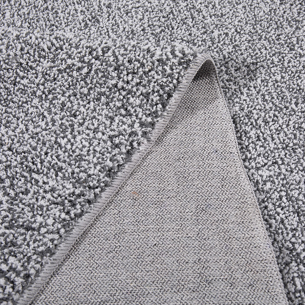
Loop pile solid rugs — where the fiber is woven in uncut loops — create a more matte, textured surface than cut pile. Bouclé and loop constructions have a slightly nubby quality that adds visual interest to plain colors in a more understated way than a shag or plush pile. These constructions are particularly popular in neutral solid rugs — cream, oatmeal, warm gray — where the looped texture gives the surface enough visual movement to prevent the rug from reading as flat or plain.
Flatwoven solid rugs have no pile at all — the texture comes entirely from the weave structure. A tightly woven solid flatweave reads almost like a panel of color on the floor, clean and graphic. A more loosely woven or ribbed flatweave shows the weave structure clearly, adding a subtle horizontal or diagonal texture to the solid color. Flatweave solid indoor area rugs are the most practical choice for high-traffic areas and dining rooms because their low profile makes them easy to clean and resistant to crushing under heavy use.
Color priorities shift between rooms based on the practical demands of each space and the mood you want to create. The following room-by-room guide gives specific color direction rather than generic advice, based on how each space is typically used and what works best in real-world interiors.
One of the most practical applications of a plain area rug is in open-plan living spaces, where distinct functional zones — a seating area, a dining area, a reading corner — share a single continuous floor surface without physical walls to define them. A solid rug in each zone creates a visual boundary that signals "this area has a different purpose" without installing anything permanent or reducing the sense of spaciousness that makes open plans appealing in the first place.
The color relationship between the rugs in adjacent zones matters significantly in open-plan applications. Using two solid rugs in completely contrasting colors creates a strong zone definition but can make the overall space feel divided and choppy. A more successful approach is to choose solid rugs that are in the same color family but at different values — a medium gray in the seating area and a deeper charcoal in the home office corner, for example — or in complementary colors from the same overall palette. This creates clear zone boundaries while maintaining visual continuity across the open plan.
Alternatively, using one solid area rug and one patterned rug in an open-plan space works well when the pattern rug's colors echo the solid rug's tone. The solid and patterned rugs read as part of the same scheme rather than competing elements, and the variation in surface character distinguishes the zones clearly without color conflict. In this scenario, placing the solid rug under the seating area — where it provides the calm visual foundation for the main social space — and the patterned rug under the dining area tends to produce the most balanced result.
Solid rugs have specific quality indicators that are easier to evaluate precisely because there is no pattern to distract from the construction. When the entire surface is one color, any inconsistency in pile height, color evenness, or weave quality is immediately visible. These checks are worth performing before committing to a purchase, particularly when buying at a mid to premium price point.

ADD: No.75 Zhenyuan Road, Yuecheng District, Shaoxing City, Zhejiang Province, China 312000

Tel : +86-189 6750 9795

FAX : +86-0575-8803 2773

Email : fisher@benetextile.com
Copyright © Zhejiang Benyi Textile Technology Co., Ltd. All Rights Reserved. Carpets and Rugs Manufacturer

 English
 Français
 Deutsch
 عربى
عربى